When designing metal buildings, the choice of colors plays a pivotal role in determining its overall aesthetic and curb appeal. While many assume metal structures are restricted to dull shades of gray or industrial hues, the reality is far more vibrant. Metal buildings can feature a wide spectrum of colors, allowing for unique and eye-catching designs that rival traditional construction. With the help of tools like a color visualizer, you can experiment with different color schemes, enabling a more interactive and creative approach to your design process.
In this blog, we will dive into essential considerations for selecting the best color for your metal buildings. We’ll cover popular color trends, explore the psychology of color in architectural design, and share practical tips for harmonizing your building’s exterior and interior shades.
Table of Contents:
- The Role of Color in Metal Building Design
- Key Factors to Consider When Selecting Colors
- Trending Color Options for Metal Buildings
- How Color Psychology Shapes Architectural Choices
- Strategies for Matching Exterior and Interior Colors
- Next Steps to Bring Your Vision to Life
- Commonly Asked Questions About Metal Building Colors

Understanding the Importance of Color Selection
Color is a powerful tool in shaping the aesthetics of any building, and metal structures are no exception. The right color scheme not only enhances the visual appeal of your metal buildings but also creates an inviting atmosphere for both occupants and visitors. Beyond its aesthetic value, color influences how your building integrates with its surroundings, helping it stand out or blend in seamlessly. A carefully chosen palette can convey professionalism, modernity, or a sense of harmony, making your metal buildings a true reflection of your vision and purpose.
By adding variety and experimenting with visual tools, you’ll discover that metal buildings are anything but monotonous. Their versatile nature and endless color possibilities prove that function and beauty can coexist seamlessly.
The Impact of Color on Building Design and Aesthetics
Color selection is a cornerstone of architectural design, serving both functional and aesthetic purposes. The right color choices can accentuate architectural features, mask imperfections, and make your building stand out in a positive light. For instance, lighter hues like whites and pastels create an impression of spaciousness and openness, while darker tones impart a sense of sophistication and authority.
Equally important is the psychology of color, which influences emotions and moods within a space. Different colors trigger different reactions—blue, for example, is associated with calmness and productivity, making it an ideal choice for office environments. Meanwhile, red conveys energy and passion, making it a great option for spaces like recreational facilities or restaurants that aim to evoke excitement and vibrancy. By carefully considering both the visual and psychological impact of colors, you can create a building that is not only visually appealing but also emotionally resonant.
How Color Influences Building Maintenance
The color of your metal buildings plays a key role in determining its maintenance needs and overall efficiency. Light-colored finishes reflect more heat, which reduces solar radiation absorption and helps lower cooling costs in warm climates. On the other hand, darker colors retain heat, making them a practical choice for colder environments. However, darker shades may require more frequent cleaning to maintain their appearance, as they tend to show dirt and grime more easily.
Additionally, the durability of your building’s exterior is influenced by the color you choose. Some colors are more likely to fade or discolor when exposed to prolonged sunlight, while others are specifically designed to withstand harsh environmental conditions. When selecting a color, it’s important to balance its visual appeal with its ability to remain vibrant and resilient over time.

Key Considerations for Selecting Metal Building Colors
Choosing the right colors for your metal building, whether for metal garages, barns, RV covers, or carports, involves more than just picking what looks good. Several critical factors must be evaluated to achieve a balanced and practical design that aligns with your needs and preferences.
When planning your color scheme, it’s important to go beyond surface-level aesthetics and think about how the chosen hues will affect the building’s functionality, environment, and compliance with regulations. Thoughtful selection can ensure your structure is visually appealing, efficient, and suited to its intended purpose.
Pro Tip:
Before finalizing your color choices, consult local building codes and regulations. Certain areas, such as historical districts or neighborhoods with strict aesthetic guidelines, may have restrictions on building colors. Confirming compliance beforehand can save time and prevent potential issues.
Aligning Color Choices with the Purpose of Your Metal Building
The intended purpose of your metal building is a key factor in determining the most suitable color scheme. For commercial buildings, selecting colors that align with your brand identity can reinforce a professional and cohesive image. On the other hand, for residential buildings, choosing colors that harmonize with the surrounding environment can enhance the sense of integration and natural balance.
Additionally, the psychology of color plays a pivotal role in supporting the functionality of your building. Different colors evoke unique emotions and can influence productivity, mood, and energy levels within the space. For example, calming tones like blue may be ideal for workspaces, while energizing hues like orange could enhance creativity in recreational areas. By understanding these psychological effects, you can craft a color palette that not only complements the purpose of your building but also elevates its overall utility and ambiance.
Considering the Surrounding Environment and Landscape
When selecting colors for your metal buildings, take into account the natural and built elements in the surrounding environment. Features such as trees, open fields, or nearby structures can provide inspiration for a color scheme that complements or contrasts beautifully with the landscape. Choosing hues that harmonize with the environment can enhance the building’s visual appeal and help it blend seamlessly with its surroundings.
Incorporating biophilic design principles into your color selection can further strengthen the connection between your building and nature. Opting for colors inspired by natural elements—like earthy greens, soft browns, or sky blues—creates a calming and inviting atmosphere. This approach not only enhances aesthetics but also promotes well-being and a sense of harmony within the space.
Adapting Color Choices to Local Climate and Weather Conditions
The local climate and weather patterns play a significant role in selecting the right colors for your metal building. In hot climates, lighter colors like white or pastels can reflect sunlight, helping to keep the interior cooler and reducing energy costs. In contrast, for regions with heavy rainfall or snow, darker or neutral shades that can mask dirt and stains are a practical choice for maintaining a clean appearance.
Equally important is the durability of the paint or coating used on your metal buildings. Opt for fade-resistant and weatherproof finishes to protect your structure from environmental wear and tear. This not only preserves the aesthetic appeal of your building over time but also minimizes maintenance costs, ensuring that your investment remains functional and visually appealing for years to come.
Popular Color Options for Metal Buildings
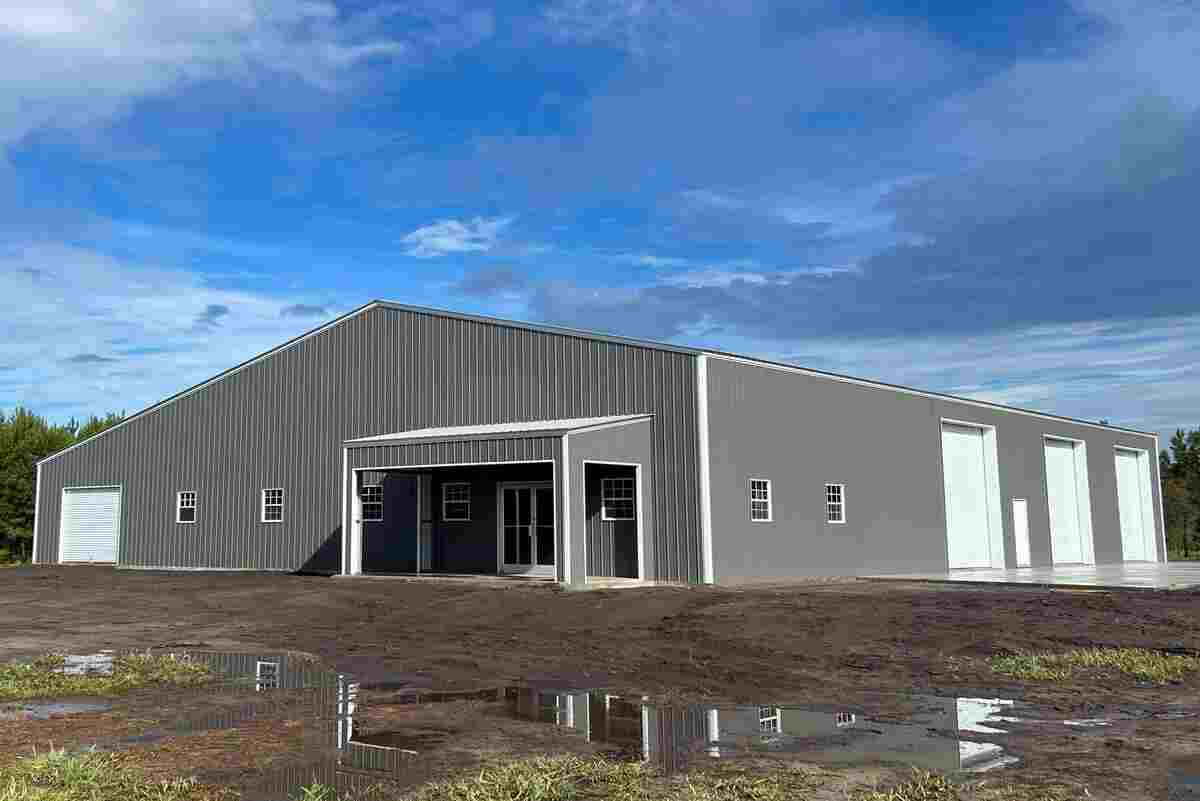
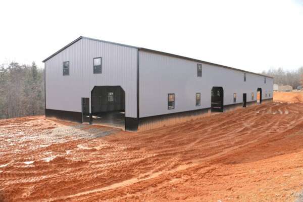
Metal buildings offer an extensive palette of color choices, from neutral tones like beige and gray to bold and vibrant hues such as red and blue. The right color selection is more than just a matter of aesthetics—it can also influence your building’s energy efficiency and overall functionality.
For instance, lighter colors like whites and pastels are excellent for reflecting sunlight, reducing heat absorption, and lowering cooling costs in warm climates. Conversely, darker colors are ideal for colder regions as they absorb more heat, helping to naturally warm the building.
Did You Know?
Pre-painted metal panels are a game-changer in durability and appearance. These panels have the color integrated directly into the material, ensuring long-lasting vibrancy and resistance to fading. Unlike traditional paint, which requires frequent touch-ups, pre-painted panels can maintain their color and finish for over 30 years, offering both style and longevity.
The Benefits of Neutral Colors for Metal Buildings
Neutral colors, such as whites, grays, and earth tones, are a popular and practical choice for metal buildings. Here’s why:
- Timeless Appeal: Neutral tones provide a classic look that suits various architectural styles, from traditional to modern.
- Versatility: These colors easily blend with both natural surroundings and urban environments, ensuring your building complements its setting.
- Low Maintenance: Neutral shades are excellent at hiding dirt, dust, and debris, requiring less frequent cleaning and upkeep.
- Adaptability: They serve as a great base for additional design elements, such as bold trims or accent colors, adding flexibility to your design.
- Professional Appearance: Neutral colors exude simplicity and elegance, making them an ideal choice for commercial and residential buildings alike.
By choosing neutral colors, you can achieve a balance of functionality, aesthetics, and practicality for your metal building.
The Appeal of Bold Colors for Metal Buildings
Bold colors, such as red, blue, or green, are perfect for those seeking to create a visually impactful and unique structure. These vibrant hues can inject personality and charm into your metal buildings, making it a standout feature in any location.
Benefits of Bold Colors:
- Striking Visual Appeal: Bold colors draw attention and make your building memorable.
- Customization: They allow for creative expression, reflecting the building’s purpose or brand identity.
- Versatility for Modern Designs: Vibrant hues complement contemporary architectural styles, adding energy and flair.
Considerations for Bold Colors:
- Harmonizing with the Environment: Ensure the chosen color complements or contrasts tastefully with the surroundings. For instance, a bright blue building may be ideal in an urban setting but could feel out of place in a forested area.
- Purpose-Driven Selection: Match the color to the building’s function—for example, red for an art gallery or green for a wellness center.
- Emotional Impact: Bold colors evoke strong emotions. Understanding the psychology of color helps in choosing shades that align with the desired ambiance or function.
By thoughtfully incorporating bold colors, you can create a visually stunning building that aligns with its environment and purpose while leaving a lasting impression.
Making a Statement with Bold Colors
Bold colors such as red, blue, or green are excellent choices for those seeking to make a statement with their metal building. These vibrant hues infuse personality and charm into the structure, ensuring it stands out as a visually striking centerpiece in its surroundings.
However, the choice of bold colors should be guided by the building’s purpose and its environment. For example, a bright red exterior can create an impactful and dynamic look for a modern art gallery, but it may feel out of place in the tranquil setting of a countryside retreat. Additionally, understanding the psychology of colors is crucial in this decision-making process, as different shades evoke various emotions. A deep blue might convey stability and professionalism, while a bold green can symbolize growth and vitality. By thoughtfully considering these factors, you can select a bold color that enhances your building’s purpose and resonates with its surroundings.
Exploring the Psychology of Colors in Architecture
Colors have a profound psychological impact, influencing emotions, moods, and perceptions of space. In architectural design, understanding the psychology of colors allows you to select shades that create a specific atmosphere and enhance the experience within your metal building.
Color does more than contribute to a building’s aesthetic appeal; it shapes how people interact with and perceive the space. For example, warm tones like red and orange can energize and stimulate creativity, making them ideal for dynamic environments. Cooler hues like blue and green evoke calmness and focus, suiting workspaces or relaxation areas. Neutral colors provide balance, offering a versatile backdrop for various functions.
By applying insights from color psychology, architects and designers can design spaces that resonate emotionally with occupants, creating environments that are not only functional but also deeply engaging. Thoughtful color choices can transform a metal building into a space that feels welcoming, inspiring, or serene—depending on its intended purpose.
How Colors Shape Mood and Perception
Colors have a powerful influence on mood and perception, making them a key element in architectural design. Warm colors like reds and yellows generate feelings of energy, excitement, and warmth, making them ideal for dynamic spaces such as recreational areas or social hubs. In contrast, cool colors like blues and greens evoke tranquility and relaxation, making them well-suited for workspaces, bedrooms, or environments designed for calm reflection.
Beyond the color spectrum itself, the saturation and brightness of a hue can further shape its impact. Bold and vibrant colors bring a sense of playfulness and energy to a space, while muted tones provide a sophisticated and understated ambiance. These characteristics, combined with how colors interact with light and spatial elements, can transform the perception of a building’s interior and exterior.
By thoughtfully integrating color into your metal building’s design, you can craft an environment that not only supports its functional purpose but also enhances the overall experience for its occupants. This deliberate approach ensures a harmonious, visually engaging, and emotionally resonant space.
The Symbolic Power of Colors in Architecture
Colors are not just visual elements; they carry deep symbolic meanings that vary across cultures and contexts. For instance, red often symbolizes strength, vitality, or passion, while blue is frequently associated with trust, professionalism, and calmness. When designing metal buildings, it’s important to consider how these symbolic connotations align with the building’s purpose and the image you want to project.
Cultural significance also plays a pivotal role in how colors are perceived. In some cultures, specific colors may hold religious, historical, or traditional importance, shaping the emotional response of individuals to a space. For example, white may signify purity in one culture but mourning in another. Understanding these nuances can help architects and designers create buildings that resonate positively with diverse audiences.
By taking cultural and symbolic meanings into account, you can design a structure that not only aligns with its intended function but also fosters a sense of connection, inclusivity, and belonging among its users and the broader community. This thoughtful approach ensures that your building communicates its purpose while respecting the cultural context in which it exists.

Tips for Harmonizing Exterior and Interior Colors
Coordinating the exterior and interior color schemes of your metal building is essential for creating a cohesive and visually pleasing design. A well-thought-out color palette can not only enhance the aesthetic appeal but also contribute to a welcoming atmosphere and improved functionality. Here are some practical tips to help you achieve seamless color coordination:
- Start with a Consistent Theme
Decide on a central theme or mood that reflects the purpose of your building. For example, a professional setting might benefit from neutral and muted tones, while a recreational space might embrace bold and vibrant colors. - Use Complementary Colors
Select colors that complement each other on the color wheel. This approach ensures balance and harmony between the exterior façade and the interior spaces. - Consider the Environment
Incorporate colors that harmonize with the building’s surroundings. Use nature-inspired tones for outdoor settings or urban shades for city-based buildings. - Create Flow Between Spaces
Use transitional colors in entryways or shared areas to create a smooth flow between the exterior and interior. For instance, a lighter version of an exterior color can be used inside to maintain continuity. - Think About Light and Texture
Remember that lighting can alter how colors are perceived. Test your chosen colors under natural and artificial light to ensure they look consistent. Also, consider the texture of surfaces, as matte and glossy finishes can affect the appearance of the same color. - Align with Branding
For commercial buildings, use your brand colors strategically in both exterior and interior designs to reinforce your identity and create a professional image. - Seek Professional Input
When in doubt, consult with a color specialist or designer to ensure your choices align with your vision and achieve the desired outcome.
By following these tips, you can craft a color scheme that ties your building’s exterior and interior together, ensuring a harmonious, functional, and inviting space.
Achieving Harmony with Complementary Colors
Incorporating complementary colors—those positioned opposite each other on the color wheel—can create a balanced and visually engaging effect in your metal building design. For example, pairing a cool-toned exterior like blue with warm-toned interior accents such as orange or yellow fosters a sense of harmony and adds vibrant contrast. This thoughtful color pairing not only enhances aesthetic appeal but also introduces depth and character to the space.
Tips for Subtle Contrast
While complementary colors can make a striking statement, using them in their purest, most saturated forms might feel overwhelming. Instead, consider opting for muted or desaturated versions of these colors to achieve a more sophisticated and calming atmosphere. For instance, pair a soft pastel blue with a warm terracotta or a dusty orange for a balanced yet understated look.
Leverage Visual Tools
For a clearer picture of your color choices, consider using tools like the Color Visualizer. This resource allows you to experiment with various color combinations on a metal building design, giving you a realistic preview of how your preferred shades will look on a completed structure. By testing different palettes, you can confidently select a color scheme that suits your vision and enhances the overall appeal of your building.
Why Choose Prestige Steel for Your Metal Building Needs?
When it comes to metal building solutions, Prestige Steel Structures stands out as a trusted leader in the industry. Whether you’re planning a residential, commercial, or agricultural project, our expertise and commitment to excellence ensure you receive a structure that exceeds expectations. Here’s why Prestige Steel is the right choice for your metal building needs:
- Tailored Solutions for Every Project
We understand that no two projects are alike. Prestige Steel offers fully customizable options to ensure your metal building is designed to meet your unique requirements. From barns and carports to commercial buildings and specialized storage solutions, we deliver versatility without compromising quality.
- Unmatched Durability and Quality
Our metal buildings are built to last. Using top-grade materials and advanced construction techniques, we create structures that can withstand the harshest weather conditions while maintaining their integrity and functionality.
- Streamlined Delivery and Installation
Prestige Steel Structures makes the process easy with free delivery and installation services. Our efficient team ensures your project is completed on time and with precision, providing a hassle-free experience from start to finish.
- Commitment to Customer Satisfaction
Your satisfaction is our top priority. We take pride in delivering metal buildings that not only serve their purpose but also enhance the aesthetics and functionality of your property. Our team works closely with you to ensure every detail aligns with your vision.
- Comprehensive Expertise
With years of experience in the industry, Prestige Steel is equipped to handle projects of any size or complexity. Whether you need a small backyard shed or a large-scale commercial facility, we have the skills and resources to bring your ideas to life.
At Prestige Steel Structures, we’re not just building metal structures—we’re building trust and delivering solutions tailored to your needs. Contact us today to explore your options and discover why Prestige Steel is the premier choice for metal buildings.
Conclusion
Choosing the perfect color for your metal building is a creative and strategic decision. The right color enhances aesthetics, improves energy efficiency, and aligns with your building’s purpose and environment. Whether you prefer timeless neutral tones or bold, eye-catching shades, understanding color psychology and maintenance needs ensures a well-rounded choice. Experiment with visual tools, consider the surrounding landscape, and prioritize functionality alongside style. With thoughtful planning and the expertise of providers like Prestige Steel, you can design a metal building that stands out while meeting all your practical and aesthetic requirements. Begin your journey today and make your vision a reality.
FAQs
What are the most popular colors for metal buildings?
Neutral shades like gray, beige, and white are most popular for their versatility and timeless appeal.
How does climate impact color selection for metal buildings?
In hot climates, light colors reflect heat, while darker colors retain warmth in cooler regions.
Can I customize my metal building’s color scheme?
Yes, most metal building providers offer extensive customization options to fit your design preferences.
Do bold colors fade faster on metal buildings?
Bold colors may fade quicker under UV exposure, but high-quality coatings can mitigate this issue.
Are there tools to visualize metal building colors before finalizing?
Yes, color visualizer tools allow you to preview and experiment with different color combinations.
User Also Say:
Thoughts on best metal building color combinations.
User 1: store****L**
We have black siding and roofing on all our buildings, and we don’t find it noticeably hot at all. It’s nothing like the intense heat you’d feel from a car left in the sun. While the surface of the metal may technically be a few degrees warmer, it’s not significant enough to justify choosing a different design. Plus, the modern coatings used on metal roofing help mitigate heat absorption, making it a practical and stylish option.
User 2: Sean B****
The choice of color depends heavily on location and climate. In hot regions, white or silver is ideal for reflecting infrared (IR) and ultraviolet (UV) rays, reducing heat absorption. In colder areas, darker colors are better for absorbing daytime heat and maintaining warmth. For my project, I opted for a white corrugated steel roof on the south side to maximize reflection and cooling, while using a modern dark brown on the north half to balance aesthetics and thermal efficiency. This combination not only enhanced energy performance but also added a unique, visually appealing contrast to the overall design.
User 3: MsJe****
I went with a medium gray for both the roof and siding, and it’s been a great balance. It doesn’t show dirt easily, blends well with the surroundings, and doesn’t feel overly hot even in the summer. I think combining functionality with aesthetics is key, especially if you’re in an area with fluctuating temperatures.

